 I have called my magazine 'School Gossip'. I chose this name because it highlights a pupils secondary school life as a whole. The colour scheme of my masthead is Black and Yellow, I used these colours as they represent the schools traditional colours and I feel that they will attract the audience as well as using the word 'Gossip'. The stroke around the text is yellow and stands out around the black writing, I used this because the yellow shows and highlights the main purpose of the magazine by suggesting that inside the magazine there will be gossip within the school. The mast head is large on my front cover as it helps stands out to the audience.
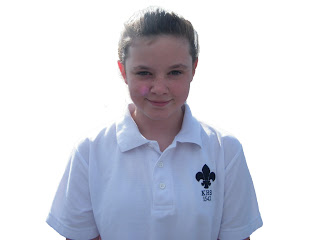
 For my main image which dominates the front cover I took a photo of a year 7 pupil called Katie. She is representing the story of how the year 7's are settling into King Henry. I took a medium shot of this pupil and removed the background. Before removing the background there were tennis courts where Katie was stood, removing the background sing Photoshop allowed the image to be focused on her. The pupil is wearing a sports kit which shows her interest in a certain subject.
I have used three subsidiary images that are all each turned at a 15 degrees angle or -15 degrees angle and overlapping each other. I have used these types of images to show the other contents within the school magazine.
The first image I used was of King Henry's main reception, I used this image as a representation of a welcome back to the school. You will also see a repeat of the colours Black and Yellow which shows more of the meaning of the colours in the masthead and also helps carry on the colour scheme.

The second subsidiary image I used is a medium two shot of year 7 pupils in a music room, we know this because we can see keyboards and music posters in the background. This image could suggest the talent the school can offer, we can also see that the pupils enjoy this subject to their happy facial expressions in the image.
The last image I used is of two sixth formers, we know they're sixth formers as they're not in the school uniform. These students are stood outside upper school hall which is used as the sixth form area where they spend there study periods, breaks and lunch times. I used this image to show that there will be a section of the magazine on sixth formers and that the magazine is aimed at the whole school community and not just the majority. The facial expressions of these students show that they're bubbly students and enjoying being in sixth form.
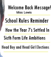
 On the right of my front cover I used five sell lines, this indicates the contents of the magazine. I used Black writing and I have also used a line to divide the contents up and made it yellow to fit in with the Black and Yellow theme. I did this to show that they will not all be on one page and that there will be different stories. I also used a different font for the sell lines and made them bold so that they stand out next to the main image. I made sure that the text was a reasonable size so that it stands out and is readable to the audience.
Magazine Cover before further editing
This is the first draft of my magazine cover before editing and adding more features to my front cover. I also added a header bar and a footer bar to show the latest content and to show the target audience of the magazine.While editing my front cover further I decided to add an issue number and a price, I did this so that the customer has an idea of the price they will be paying and the number of magazine that have been issued through the school year.
I also decided to put in a Pull Quote and a Splash. I used a Pull Quote to give the reader a preview on what the pupil has said. I also used a Splash to give more of an idea of where the quote came from. I think this is a good idea because this may bring the reader to understand the main story in the magazine and will bring the reader in to bring it.
Completed Front Cover
The front page of my magazine has a clear and organised layout. It isn't too cluttered or messy, and is presented well. My front cover shows information about school life which would appeal to my target audience who are pupils and students in King Henry. I believe that my front cover is recognisable to the school as it uses the traditional colours.I am pleased with how my magazine front cover has turned out. I feel its inviting to young pupils. They layout I have used is effective and works well with my main image. I like the way I have tilted and overlapped my subsidiary images as I think its effective. I am also pleased with my main image as I think it works well on the page. However, I had to resize the image to make it larger due to a lot of blank space on the page. I think it now looks better as its more presentable and filled.


A good front cover, Megan. You have displayed a proficient understanding of the codes and conventions of magazine covers. You have also used InDesign successfully to create the layout and design of your page. Your planning notes are detailed.
ReplyDelete